Monday, February 27, 2012

Bonkers for Birds


Maybe I inherited it from my dad, who is an avid bird watcher, but I am just crazy in love with bird things.
Granted my obsession is slightly different from my dads; He walks around mountains, forests, and lakes with binoculars and I trawl the Internet, magazines, and various boutiques with my iPhone. 
(Barbara Wakefield and West Elm products pictured here)  


But essentially we are doing the same thing.   Looking for the rarely seen, beautifully designed and delightfully surprising BIRD.  sigh.

I needed something special to flank each side of my fireplace - Most of the time you want a special piece of art or a mirror to go over the fire place, but as the ceilings in my circa 1930's building aren't that high, that wall really was begging for art work on either side of it.

For almost a year I tried various things, butterflies, black and white portraits, nothing.... finally I spent ONE DAY solving this problem for a grand total of $15.95

First, I had these two ikea frames, which I had bought to house my logo for my booth at the Green Living Show.   They had just been hanging about and getting in the way since I wasn't crazy about a dark frame in my nice fresh light apartment.


So of course I painted them - using a couple of sample pots from various clients projects.
Sample pots of paint don't have any finish to them so they are flat flat flat - great for walls but boring for my frames.    So I poured an entire tub of white glue over them and vacated my apartment for the rest of the afternoon to escape the fumes.   (Obviously, the last part hadn't been thought through very well)


I escaped across the street to a local coffee shop, The Remarkable Bean where I found and bought two satellite images - one of Sydney, Australia and the other of London, UK.

I emailed these over to my friend, and sometime savior, Sona at The Mail Slot and asker her to print a large format glossy images of each.


I traced out a Kookaburra on the back of one and a nice fat Robin on the back of the other, and using a scalpel I carefully cut around the silhouette.
Luckily I got them the right way round!
After spray mounting them onto a nice fresh crisp watercolour paper I framed them in my new bluey green frames and am super pleased with the result.


p.s.   can you spot the opera house?

Saturday, March 19, 2011

I heart Anthropologie


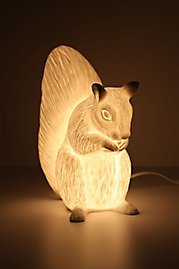
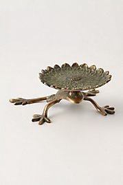
I just discovered the home section of Anthropologie, and discovered a great selection of unique and pretty treasures for the home.
I have decided to post some of my favourites !  check out all the fun stuff at 

http://www.anthropologie.com/anthro/catalog/category.jsp?navAction=jump&navCount=0&id=HOME


Apparently they do more than pretty dresses and tops …. Who knew !

Friday, February 18, 2011

Digs Befitting The Oldest Profession

If you have been watching Britain’s 'Secret Diary of a Call Girl' you would never suspect from the show that the UK is suffering from a massive financial crisis.....ah well, It just goes to prove two things:

1.  When economic slow-down strikes, the peeps want to see glamour and bling more than they do when times are good.

and

2.  Professional Escorting is a recession proof career path.

But I digress… this blog post is not about the lucrative benefits of high end whoring and its relationship to economic indicators, it’s actually about her flat.   Or rather the Stylists behind the risers.
Season 1…. Slightly bohemian with bollywood colours, but nothing to blog about.
Season 3…..  same same, don’t get me wrong though !  great stories.
Season 2 …. Okay, here we go !  Same flat, whole new look, way more sophisticated.   Love the wallpapered kitchen backsplash.


Season 4…. Oh YA !  Belle’s bought a house.


Since we are only two episodes in she is mostly still in boxes, but between the handsome cast, delicious fashions, the gray front hall and the awesome black banister season 4 is promising promises for a season of yummyyummy eye candy.


Wednesday, February 2, 2011

Colour Courage !

wow.... do  I ever love clients who love colour !! Put your sunglasses on and check out the pics this client sent to me for inspiration.    It has been snowing here in Toronto all day and huddling around these shots is as good as warming up by the fire.   wooohooooo !
Considering her partner is kinda nervous of colour I have toned it down a bit with these bold and beautiful gems from Robert Allen.
What a great palette to play with on a cold day  - thanks brave client. x


Here is what I came up with :
Bedrooom


Den


Open plan living / dining / kitchen

Wednesday, January 19, 2011

Dont walk all over the Rug


Oh the area rug... we step on it, the dog barfs on it, food is spilt on it.   It's the only item in the house that takes all this abuse but yet we want to be able to sit on it. 
My experience is it’s often neglected or even omitted all together.   However, in my opinion it is one of the most important items in your room.
A good area rug will define the space, soften the room, absorb sound and –as a committed floor sitter – give your toosh a bit of cushion.
All this good stuff doesn’t come cheap.   An area rug is going to be one area you are going to want to splash out large on, and if you choose wisely you will be luvin’ it for a long time.
The options are endless and I have included some here that are eco AND original.


Saturday, January 8, 2011

Distracted by shiny things


I just got the latest catalogue for Design Within Reach (deceptively named as it is only within reach if you have lots and lots of disposable dosh)

Conveniently I had the mag tucked into my handbag today so I happily amused myself within it’s glossy pages while I waited for the tanning booth.
Don’t judge me.  
It makes me feel better.
I’m not a winter person.

But I digress.

A small ladylike dollop of drool landing on the image of a new item by One & Co called “TABLE 47” thus snapping me out of my aesthetic stupor and into an acquirement achieving frenzy…
Not having  $1200 bill floating around in my wallet, the clogs of my brain began to churn and I began to imagine how to make this for myself.
Hmmmm….    I must introduce a stump of wood from my moms yard to a box of silver leaf and see what happens!

If you, on the other hand, happen to have one of these coveted $1200 bills in your wallet, then be reassured that One & Co are committed to the green revolution, and you will be pleased to know that your silver stump will consist of reclaimed wood and some sort of “proprietary low-VOC processing’ in order to achieve the silver effect.

Another project lined up and ready to be executed…. Again watch this space!

Ps I AM working on those chairs by the way.   

Wednesday, December 22, 2010

Grey is a colourful colour

Many many many.... well, a lifetime ago....when I was a know-it-all art student, I learned that pale grey is the best background colour to emphasize a colour in the foreground.... and in fact, most art gallery walls are painted a very pale grey to allow for maximized viewing pleasure.  I always forget to check that fact - Im too busy looking at the art.  Perhaps this proves the point !!


I see no reason why this age old trick cant be used at home, and even though many peeps balk at the idea of painting their walls grey, they are always happy with the end result.   Let's face it.... a painted wall is not a focal point !  even a feature wall is not a focal point but rather whatever resides on its surface ie fireplace, painting etc.
So here are a few of my favourites found on the internet.
And when I have finished posting this I plan to crack open my tin of Benjamin Moore's Natura colour OC 52 Gray Owl and slap it on my walls. whoopeee !